
TIMELINE
3 Months
TITLE
Product Designer
TEAM
1 stakeholder
1 designer (me!)
TOOLS
Figma
FigJam
Miro
Google Forms
CONTEXT
Feeling like the current selection of dating apps does more harm than good, this early stage startup idea revolved around making matchmakers more accessible to the general public via a premium dating app experience.
KEY INSIGHTS
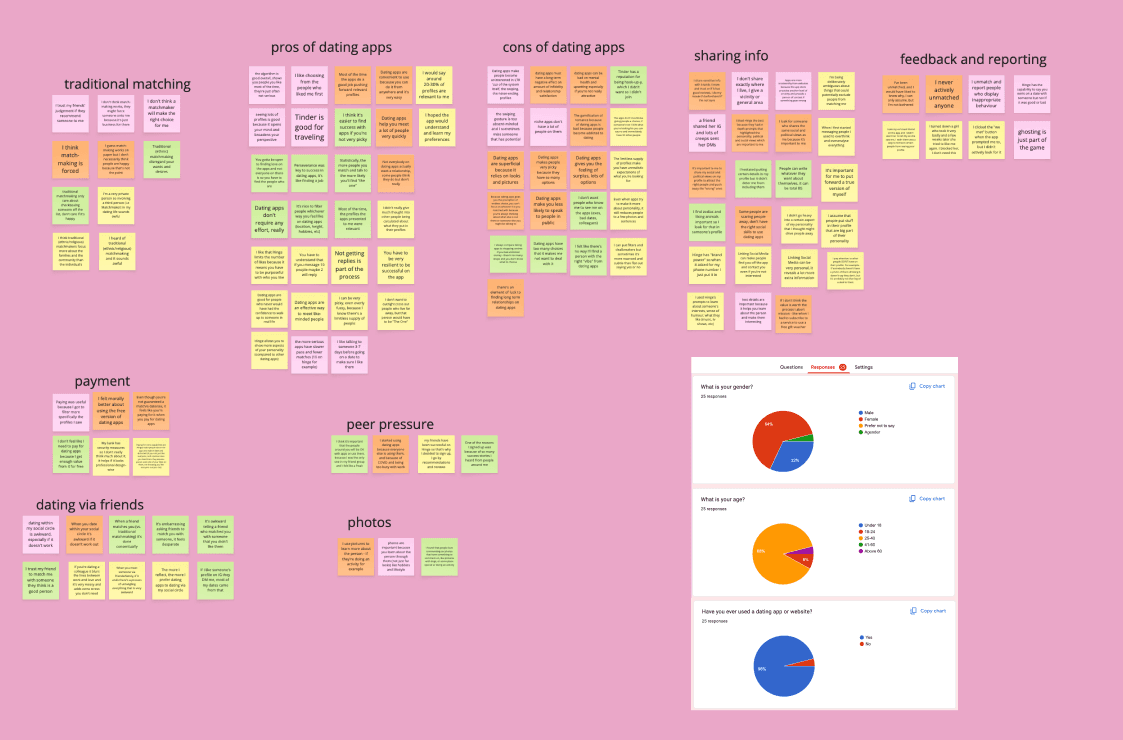
*I sent out a survey to 25 participants and conducted semi-structured user interviews with 4 participants.
"I CAN BE OVERLY PICKY"
Whilst we find it hard to surmise our personality into rigid profile structures, we judge others based on what they choose to include or exclude.
"I DON'T WANT ANYONE ELSE INVOLVED"
Meeting partners through mutuals is deemed as embarrassing (what if it doesn't work out?) and matchmakers? They're perceived as self-interested or old-fashioned.
THE PROBLEM
Despite frustrations with the current dating apps, users had negative feelings towards the involvement of matchmakers, viewing them as invasive and old fashioned.
THE SOLUTION
Keeping the matchmakers as the background "algorithm" whilst designing a user-facing experience that tackles choice paralysis, swiping fatigue and the pressure of a perfect profile.
THE DESIGN
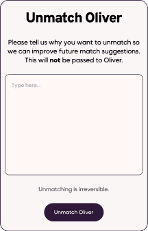
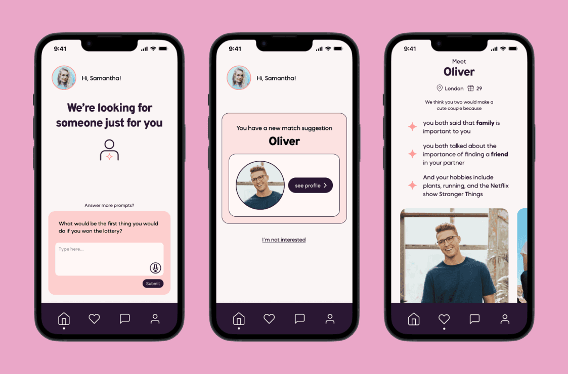
Rebranding and reducing the exposure to matchmakers
Users didn't want matchmakers, so we kept them as the engine of the product, but gave it a modern twist to communicate their job better: "relationship experts" who coach users into healthier dating habits so when they meet someone great - they're ready for them.

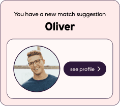
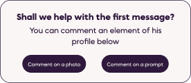
Removing swiping and profile noise
Unlike other apps, matches aren't waiting for you. Instead, they arrive sporadically, one at a time, when a matchmaker finds someone worth your attention.
No endless options to swipe through, no FOMO, no choice paralysis.
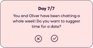
Designing against bad dating habits
Online dating enabled ghosting, juggling conversations and never committing to meeting IRL. Connected fights against this with chat milestone rewards that nudge connections forward, because the whole point is to get you off the app and on a date.
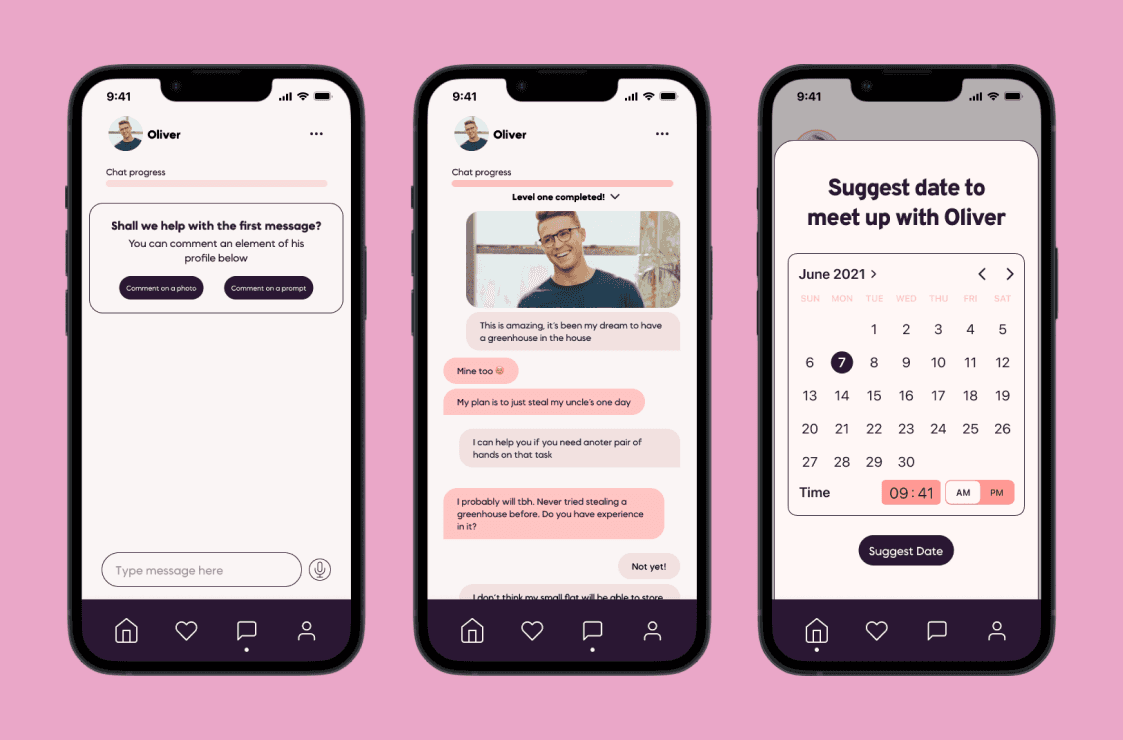
When is a good time to ask for money?
A flat subscription felt arbitrary when you don't control the volume of matches, and an earlier payment point scared users into bailing. So I suggested a small fee to unlock the chat, only charged if both users opt in. The sense of commitment this creates is just what we want.

THE OUTCOME
0 → 1 UX and UI design, including research, ideation, testing, iteration and high-fidelity screens for main flows completed within 12 weeks.
Project stakeholder adopted and implemented the problem-solving pivot I suggested, centred around existing users' needs that I discovered during the research phase. The project was delivered to use as proof-of-concept in funding rounds.
The positive user testing feedback taught me that whilst the dating app market is saturated, user-centred design creates real value that drives business growth, even in a competitive field.
More user testing is required, especially regarding payment request behaviour. This was noted as a pain point that might encourage users to use the available data to find suggested profiles on other, free platforms.
More projects

CLIENT
Designing a scalable edtech platform from scratch, shipping a live product in 4 weeks.

FINAL MAJOR PROJECT
Speculative reimagining of fan verification: who decides what makes someone fan enough to attend live shows?


CONCEPT
Identifying a gap in Spotify's listening experience and designing a solution that time proved right.